Last updated by at .

Categories
CX design technology ways of use

Teknik och tekniker – fel när tekniken är stjärnan

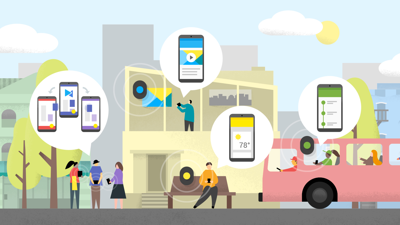
Var på ett rå-tekniskt event för ett tag sedan. Internet of things, Artificiell intelligens, producenter av sensorer, batterier och plattformar och så. Ni fattar. Väldigt mycket teknik.

Det häftigaste med teknik idag är enligt mig att den, använd rätt, är helt osynlig eller upplevs helt obemärkt. För att få till det är det extremt viktigt att tänka och designa utifrån en användare. I vissa kretsar helt självklart, i andra mindre självklart.

Jag medger att jag är lite sjuk. Vi är många sjuka, som pysslat med “internet” sedan det begav sig (nåja, för konsumenter i bred bemärkelse, så där under 90-talet). Vi går och tittar och observerar och upptäcker en massa dumma glapp mellan människa och teknik. Och med teknik inkluderar jag den allra enklaste av tekniker men även den mest avancerade. Vi ser glapp mellan människa och stad. Mellan förälder och dagis (förlåt, förskola) och pendlare och buss (speciellt när den är försenad men inte kommunicerar). Vi testar appar, bygger tjänster, fnular och testar.

Det blir galet när teknik står i centrum

Så här går det till att “välkomnas” till ett evenemang kring IoT. Avläsarna har tyvärr lite problem med infallande ljus så en “manuell operatör” måste skapa skugga.

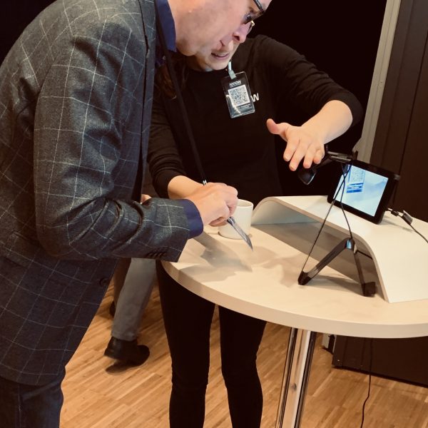
Tillbaka till eventet då. Arrow IoT 2019. Där teknik var temat och till synes också i centrum. Här ser vi en man som försökte komma in. Med hjälp av en lösning som funnits länge och hittat sin användbara plats lite här och där: QR-koder. Effektiv i exempelvis Bank-ID för att bevisa att vi är på en plats och efter det glo lite Face-ID för att identifiera oss (Skandiabanken exempelvis). Både smidigt och ett extra säkerhetslager. Mannen här däremot tvingas till en massa extra aktiviteter och märkliga beteenden bara för att få komma in till ett event han redan registrerat sig till. Det blänker i plasten på hans namnbricka där QR-koden sitter. Det ställer till det. En mänsklig operatör måste vara närvarande vid varje scanningstation för att skapa skugga och vinkla namnlappen rätt. Jo det klart, lite mänsklig kontakt blir det ju. Men av helt fel anledning.

Avläsare har i regel inga problem med små QR-koder. Våra ögon har däremot lite problem att läsa liten skrift på avstånd…

Här ser ni min namnbricka. Vad tänker ni? Precis. Här minglar man runt och vill träffa rätt människor. För det behöver jag komma ungefär 50 cm från människan. QR-koden däremot ser jag loud and clear (QR-koder kan, för den som inte vet, vara vääldigt små och ändå scannas av en kamera utan problem. Helt bakvänt. Ogenomtänkt. Och det krävs inte mycket.

En superenkel lösning som är tillräckligt bra

Denna lilla reflektion – av ett trivialt exempel – bryr sig inte om vilken (lika billig och enkel) teknik som hade kunnat göra detta mycket bättre. QR-koder kunde säkerligen funkat alldeles utmärkt som lösning. Det som behövs är att man som ansvarig gör minst två superenkla saker. Dessa är delar av ett mer omfattande tillvägagångssätt och alla med kännedom och erfarenhet av tjänstedesign, UX/CX research eller andra design-verktygslådor där användaren står i centrum känner dom. Jag vill hävda att gör man två förhållandevis enkla saker så kommer man nästan helt automatiskt och gratis väldigt långt. Gör man en tredje sak, som kräver ett lite lekfullt och nyfiket drag, kommer man ofta hela vägen fram till en mer än OK lösning.

1 Sätt människan i centrum med några enkla frågor

Vilka är våra användare? Lista dem så gott ni kan. Tidigare erfarenheter?
Vilka är våra mest centrala (prioriterade) användare? Vilka är mer avgörande? Vilka dikterar mer än andra hur er lösning ska se ut? Varför? Låt flera perspektiv utrycka sig, gärna så många som möjligt och även de utanför projektgruppen.

Gör gärna mycket mer än så, men gör i alla fall detta.

2 Deras önskade effekter och resultat

Ni vet säkerligen exakt vad ni vill få ut av er lösning, i mitt fall ett event. Men vad vill de olika användarna få ut?
Om de klappar er på axeln och säger “wow, det var såå bra”. Vad har hänt då? Vad stod ut och var mer än bara OK?
Vad har de för mål? Vad vill de känna, göra, komma ihåg? Vad ligger bakom dessa mål, alltså varför vill de detta? Hur når de dessa mål annars, utan er lösning (var absolut bättre än så)?

Institutionella falska sanningar finns i de flesta organisationer och är livsfarliga. De är exempel på hur tradition, rutin och erfarenhet kan bygga upp en kontraeffektiv och direkt farlig kunskapsbas som inte reality-checkats på länge. Så. Tala med en användare. Det är bättre än noll. Faktiskt en 100%-ig förbättring. Tala sen med 5 personer istället för 1. Kan varje inblandad person i projektet tala med 2 personer? Helt plötsligt har ni användarens egna ord med i leken med liten insats. Involvera dem som faktiskt talar med användaren (kundtjänst).

Skriv upp användarnas mål i en kolumn. Skriv upp era mål (affärsmässiga och annat) i en annan kolumn. För en dialog kring hur/var ni ser kopplingar och en form av förklaringsgrad för hur användares mål kan sitta ihop med företagsmål. Därefter kan ni fokusera på att skapa lösningarna för användarnas mål, vara trygga i att ni har en koppling till affären, och därmed kunna/våga ha användaren i centrum.

Två superenkla saker som sagt. Lite oroande att jag skriver dessa och tycker att det behövs.

3 Ett litet test

Om ni på riktigt vill och vågar förflytta er från era egna lokaler och ut till användaren (de snackar de flesta om)… Det är läskigt att sätta något ofärdigt i handen på riktiga kunder. Till och med tankar. Men gör det. Testa. En uppmaning och teori kan inte förklara det. Testa bara. Det är en häftig känsla. Inte alls så farlig som du tror. Den centrala frågan blir: hur kan vi testa det vi vill skapa på ett sätt som samtidigt är enkelt nog för oss att faktiskt få gjort? Planera inte det perfekta, planera det som blir gjort. Läs på lite om piloter, prototyper och hypoteser. Beskriv ert test så ni vet att ni testar rätt sak, vem ni testar på samt hur ni mäter (muntlig feedback som bekräftar/bestrider, är fullt godtagbart, ofta även berikande) . Allt går att testa. Jag har själv konstruerat och faciliterat organisatoriska prototyper av och i organisationer som alternativ till större planerade omorganisationer.

Alla organisationer och företag måste verkligen observera och återkoppla allt detta till synes småttiga. Det är så vi måste träna. CX (customer experience, i det här fallet) är inte för UX-folk och designers. Det är för alla när tekniken blir så central i de flesta branscher och affärsmodeller, samt genomsyrar de flesta interaktionsytor mot användare och kunder. Visst är det underbart när företag prioriterar det såpass mycket att medarbetare kan dedikera sig helt och hållet till kunder och användare. Men där är inte alla, och därför är det viktigt att det inte är en frågan om antingen eller. De 3 punkterna här är en dummy way som inte är så dum, om alternativet är att du inte gör någonting för att det blir för omfattande för ditt tycke, smak, tid, budget eller annan begränsande faktor.

Känns det läskigt. Bra. Utmana dig och gör något som är läskigt, men inte så läskigt att du inte vågar. Skruva sedan upp volymen lite. One foot in front of the other, we call it walking.

Categories
business culture organizational presentation ways of use

Tid väl använd

Jag är en nöjd deltagare av Dobermans designkonferens Frontiers of Design som gick av stapeln i Stockholm i slutet av Augusti 2018. Till Frontiers-konceptet (om jag får kalla det så) hör också en film, Frontiers of Design Film, där ett antal framstående personer inom det breda fältet design säger sitt om dess framtid. Jag fick möjligheten att se denna film på plats. Underhållande, en del tankar går igång och vacker.

En av de intervjuade personerna är Lisa Kay Solomon, från Singularity University. En person jag blev intresserad av och kollade upp. Detta ledde mig till ett TEDx-snack hon gjort ett tag tillbaka. Det låter som om hon konkretiserat och strukturerat upp mina egna tankar sedan länge, angående en viktig konkurrensfördel som vissa företag(skulturer) har/kommer att ha. Och den är väldigt mycket enklare än bäst AI-forskare, störst moln eller grymmast designers. Det handlar om respekt och förståelse för tid. En sund kritik av, samt smartheten att applicera en designers mentalitet på, möten.

Nu har jag inte en bred studie kring alla företags syn på och sätt att hantera tid, effektivitet och möten till mitt förfogande. Men min erfarenhet är, med all respekt för att många försöker, att det inte står så bra till. 

Vi har många gruppledare, team-ansvariga och personer som på andra sätt spelar en avgörande roll för hur många fler medarbetare överhuvud taget kan vara smarta och effektiva. Hur många av dessa reflekterar över hur de genomför alla dessa (för många möten är det) aktiviteter på ett allt annat än slentriant sätt? Den frågan lämnar jag där. Men jag vet vad jag själv tror.

Categories
design technology ways of use

Spotify and an audio plus visual use case

Spotify is making an interesting move with Spotlights in the podcast segment (or podcast behavior), fairly expected I would say. In one way it seems like a small addition to the core that is audio streams, but from a use case perspective it’s a rather large move from device in pocket (passive) to device in hand (active). This new use case is the interesting thing to look at, not the technology or new media type attributes.

Will be interesting to see how that plays out. I for one would love some cured tech news podcast type stuff. I can also see the value in added visuals and a new type of story telling and communication. But at the same time, am I now going to relate to, and use, Spotify like I relate to, and use, Youtube?

Personally I’ve been on about (simple prototypes proactively to Swedish Radio) at least experimenting with visual media as they explore what radio is in this technology paradigm. Everything about the definition has changed. Broadcasting music, stories and news over audio frequency (and nothing else) doesn’t mean working with radio primarily has to worry so much about that anymore. It was one mean to an end.

The media convergence happening now, combined with our attention situation/challenge, actually puts radio (or rather audio-first…) in a very interesting position. So far text (text first) based publishing seem to have been best at merging media types.

Categories
business culture digital transformation ways of use

the fallacy of thinking about doing

Theory and knowledge isn’t real. That’s why we always look for empirical evidence. It’s also why you would never qualify as a car mechanic having only read about engines. You need to get a feel for things. You need to practice doing. Doing the actual behavior we’re studying, trying to fix or do more of. Don’t really know what to think about this:

When I ask him how he knows what he knows about these new platforms, he says, “I’m not active on social media; I am a student of it,” and waves an arm at a wall of his office covered in dozens of color printouts of pie charts, tables, line graphs full of digital metrics—proprietary information that he asked remain off the record. “I spend a lot of time thinking about the trends that are reshaping our industry. I spend a lot of time talking to people on the front line of those trends,” he tells me, “and a big part of my job is making sense of that.”

– Arthur Gregg Sulzberger of NY Times, in Wired

Why cut off some of your senses? Thinking about doing things does not provide sufficient understanding of the doings studied. The most bewildering part of this is why on earth, given there’s no cost associated with it (only learnings and benefits), would you not throw yourself out there to feel what it is we’re dealing with? Beats me.

Categories
business digital future technology ways of use

Robinhood and the disruption of financial services

The financial service sector is one of the most interesting ones in terms of burgeoning disruption. A sector up until fairly recently not seen as especially dynamic – mainly because the sector itself seemed, and perhaps still is, largely uninterested in advancing things – is now rattling, shaking, squeaking and bustling in every way.

Simple Bank sold to BBVA. Tink, a Swedish company, raises more capital and claims 2% of the swedish population holds an account. In the same area, that of personal finances and money management, is another Swedish start-up in Dreams, helping individuals better save money.

This kind of stuff is natural when you think of the meaning of banks (or whatever we’ll call it). Why individuals need them in their lives. Entrepreneurs focusing on user value, solving problems and seing unmet opportunities, create these things because they should exist. They make sense. And as living our lives involves money and financial services, and technology allows for it, that industry is now booming. Great for almost everyone.

From private finance to investment and trading

Many of the new players in financial services have focused on payment and personal finance. At least the user facing ones. Robinhood takes it in another direction, that of trading.

If I were part of the old school trading industry, I’d be paying close attention as the waves of disruption come rolling in. But, what struck me in the Wired article on Robinhood, is the quote below, where the founders paint a picture, a usage scenario, that really helps us see the viability in the service, and hence potential democratisation of trading.

We all know how toilet breaks, queuing in line, bus rides, ad breaks, just-after-eating-up, micro breaks etc and so on are devoted (more by some) to not only instagram and Facebook – the status check of the collective also known as group of friends – but candy crush, poker, casino and other game like apps, providing that micro fix of excitement. Every gambling company I’ve come in contact with knows (and struggles to perfectly articulate) that intersection of fun/excitement and risk/benefit tickle. But it’s right there in the middle, which is why trading – when made accessible like this – might very well find its way into that usage occasion. I think Roobinhood perfectly exemplifies the importance of looking at behaviours in combination with technology and business vision.

Standing in line for coffee may seem like an awkward time to trade stocks. But for the makers of the new app Robinhood, those casual moments are exactly when they want to reach a new generation of potential investors who might otherwise feel the markets are closed to them.

Robinhood - democratizing stock trading
Screen grab from Roobinhood

Categories
creativity design video clip ways of use

The merge bike – for city people

See what happens when you think hard and prototype?! Love this bike built with city people in mind

Charger, lock contraption, retractable storage rack etc. And beautiful to boot. I want this.

Via psfk.com and made by Horse Cycles

Categories
design future internet technology ways of use

The internet of things – industrial internet

The incredibly smart people of BERG hacked a washer and proves a great deal of areas where connectivity help. I mean, the “find repair people” part alone is worth a lot. Some time, after 2 years of really not thinking about it. Postponing rinse takes care of the “shit, sorry I can’t because I’m doing the washing” problem. There are probably not many products that do not benefit from connectivity.

I talked aobut this and that (which is what interesets me most) with a very technically oriented ex-colleague who shared a conversation with interaction designers of a more visual background and nature, and how that hinders the thinking around connected products. “What’s a couch gonna say to me?”. Nada, but tracking the use of it provides input to material choices and manufacturing (something that today is a part of the manufacturing process, but pehaps could be combined and outsourced to “natural use situations”) as well as feedback to healthcare industries benefiting from understanding our couch-potato-behavior.

Cloudwash: the connected washing machine from BERG on Vimeo.

Categories
design digital internet technology ways of use

the reporter app – illuminating the unmeasurable

Anything that aims to do that, is interesting. The reporter app from Nicholas Fetron and Drew Breunig.

reporter app by Fetron and Drew

“Reporter can illuminate aspects of your life that might be otherwise unmeasurable.”
Reporter-app

Categories
digital future internet media ways of use

instant-on is the killer TV feature

That’s the central problem plaguing both set top boxes like Roku and Apple TV and content services like Netflix and Amazon Instant Video. Instead of letting you lean back and soak up content, these new challengers require decisions–a careful cost-benefit analysis of thousands of different options. If the traditional TV experience is about letting viewers surf channels, today’s on-demand video is like giving them a speedboat and forcing them choose a destination before they can even get in the water.

From the article “To Grow, Netflix Must Learn From the Quietly Brilliant UI of Regular TVs”, in wired

Well hear hear. This is exactly what Is missing in the creating of the future of TV. From the services currently in the market to the reasoning that goes on in pitch material, and pitches, that I’ve been involved in with regards to positioning TV content providers of today, when developing for tomorrow.

Don’t just stare at new technology and heaps of content at your finger tips. Look at the tired people whose brains stop functioning as their ass lands softly in the couch. The key feature? Bzzz – TV is on and streaming. Streaming something. One more bzzz and there’s something new.

The instant on, under a second, is something “new” TV (content, and the delivery of it) doesn’t manage. This is also why personal, pre-loaded, schedules are important. Not just because you can create your own channels based on favorite content, but because something has to start streaming as you enter couch mode. Human behaviour, not just technology.

Categories
design just a reflection nuggets ways of use

nuggets: purposeful design

the balance watch
from time differently

The balance watch (PSFK) – a very purposeful design to remind you of work/life balance. Reminds me, working with brands and overwhelmingly with communication solutions (yet not necessarily communications challenges only), that problems are affected/caused by the environment and the problem mustn’t necessarily be attacked on the level we see it. In this case; constant visual reminder in stead of perhaps a recurring yearly, quickly forgotten, resolution.

Client/agency relationship example: how much time/focus is dedicated to how you are going to solve a challenge? How you are going to work together? The fact is that solutions can be many and very different, and the how will unquestionably vary. Many great ideas die not because of the idea itself but because the parallel discussion around the process (the purposeful design thereof) of materialising it was missing (resulting in subsequent budget/timing/execution shock).

As a matter of fact, as creative agencies have more possibilities (types of solutions), speed is crucial and complexity an increasing variable – process is going (is) to be a great competitive advantage. Perhaps even the most important one.